There's just something about a farmhouse, whether historic or modern, that draws you in, especially when nestled between rolling farmland and forest. It takes mere moments to head down the little private drive to the O'Neal farmhouse before you feel you've been transported elsewhere. It's beautifully secluded and idyllic; you immediately get the sense it's a scared spot for a busy family to come together and slow their pace a bit. And this is one busy family in all the most wonderful ways- with two growing teens active in extracurriculars, and the spearheading of a non-profit making huge strides in our community. Enter a little case study in what we call the "evolution of home". We are wildly interested in the way our concept of "home" ebbs and flows as our families evolve. As your story changes, so too do the needs for your dwelling, so we were honored to help usher in a new season of improved space and function for this incredible family!
Andrea has known the O'Neals and their beloved property for years, having completed their kitchen remodel in 2017. During that phase, the small kitchen was gutted to make room for a new mudroom, laundry room, and a large open concept kitchen that vastly improved function throughout the main living area. In the winter of 2022, the bedrooms and office space began begging for their own re-imagining. Wilhouse will forever be as devoted to the thoughtful programming of a room as we are the aesthetics, and this project was no exception. Adding square footage with thoughtful attention to low-maintenance finishes and storage capabilities was at the top of the priority list. It was time to help the O'Neal house work harder for each resident!
The First Floor - (Foyer, Home Office, & Primary Bedroom)
Obtaining extra space proved straight-forward on the first floor with the decision to trade wrap-around porches for usable square footage. Both the office on the left side of the home and the primary suite on the right stood to gain radical improvements by eliminating the porches, pushing walls out nearly 8 feet, and relocating windows. This necessitated several months of construction and demo in key living spaces, so the family temporarily relocated and seized an opportunity to also update flooring, paint, lighting fixtures, trim work, doors, and hardware throughout.
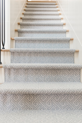
In the cozy foyer, the stairwell serves as a key focal point. To elevate it, we added a clean white wainscot on the walls, a black wrought iron railing, and stained treads to echo the new floors. Beyond the style upgrade, the main requirement was an accommodation for their aging dog who had been struggling with climbing the bare steps. By adding a geometric carpet runner to the hardwood steps, we eliminated the dog's risk of slipping and landed both safety and style!

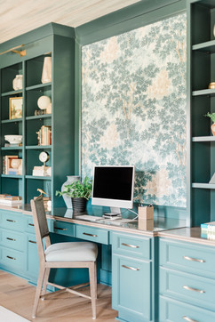
With our client's non-profit organization building steam, she was desperate for more space in the home office. Not only did she need considerably more storage, she also wanted to delineate a meeting area separate from her desk. By expanding out into the former porch area, we were able to create an entire wall of built-ins for her work zone. The new larger foot print not only granted her a dedicated meeting table, but also a cozy reading nook. Our client adores any shade of blue, so we opted for a color-drenched palette with jewel toned walls, trim and cabinetry. Accents of wood and stone soften, with an unexpected pop of texture on the grass cloth ceiling. We chose a wall mural behind the desk to break up the large span of cabinetry, and contrasted the bold colors with light drape and upholstery choices. The modern champagne finish light fixture commands attention, creating an ethereal feel against the grass cloth. Finally, a new set of iron and glass French doors provide privacy for small meetings while balancing the room's feminine energy. The study is the renovation's crown jewel, with every element combining purpose and style, and Mrs. O'Neal is quick to share it's her favorite part of the entire renovation!


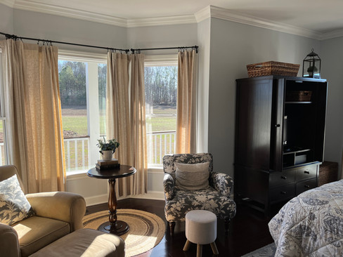
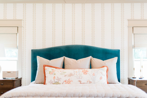
The primary bedroom also benefitted from the wraparound porch reduction, with the new square footage improving furniture layout and granting an expansive walk-in closet. Sometimes, a simple relocation can make a significant impact. With the bay window eliminated, we were able to switch the bed to the opposite wall for a stunning statement as soon as you enter the room. The deep blue velvet bed pops against the tan and white striped wallpaper on the accent wall. The extra square footage enabled us to provide ample windows for natural light, use oversized chests as nightstands, and add a seating area in front of the bed. That soft brown leather sofa (one of our favorite elements in the room) is the ultimate relaxation after a long day. Custom operable drapes, selected in a linen stripe that compliments the wallcovering, serve to block the bright morning sun and complete the room. We have always loved designing bedrooms, the details are like frosting on a cake. Every element adds depth, from the luxuriously layered orange and earth toned bedding, to the moody, richly-hued painting with framed in gold. The O'Neal primary bedroom now holds a special place as one of our favorites. We're excited to share that we'll be bringing the rest of the suite to completion later this year, so stay tuned for primary bathroom updates!

The Second Floor - (Two Teen Suites)
Now on to the second floor, where improving layouts would prove more difficult without the ability to add space. Working with tight spaces and window dormers added an extra layer of complexity, though it's a space planning challenge we welcomed! On the right side of the floor, the teenage daughter was ready to take her room from "little princess" to a suite more reflective of her personality. She occupied two small rooms, one for her bedroom and the other for crafts and dance practice. By removing the dividing wall, and reconfiguring closets in both areas, we were able provide a spacious central base for all her needs, from ballet bar to art supply and record storage.
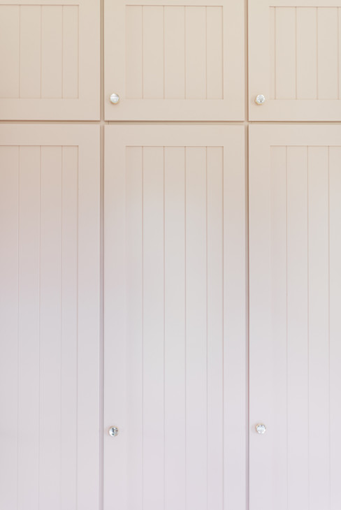
The room's centerpiece, a custom-built shelving unit with an integrated desk, offers functionality and style. Its classic gold pulls add a touch of warmth and sophistication against a delicate peachy pink finish- a tone we love for being not too pink, but just pink enough! When we returned to take photos, seeing this spot full of all her treasures, posters, and personality thrilled us the most! But the smile at the sight of a true dream room in use was second only to seeing her point shoes delicately hung on the new ballet barre. The mini dance studio comes complete with wood-toned vinyl flooring to provide a surface for perfecting those pirouettes. The bed, a golden brushed metal frame, nestles against windows that flood the room with natural light. Neutral bedding accented by a patterned bolster pillow keeps the look clean and fresh, yet fun. Overhead, a whimsical crystal and gold light fixture with branching arms adds a magical sparkle to the space, perfectly capturing our client's spirit. This thoughtfully designed bedroom isn't just a place to sleep - it's a retreat where she can dream and create!

While planning the daughter's bathroom, we learned that storage would be key for the budding skincare guru, whose countless products were overtaking her current vanity. First we removed a partition between the shower and vanity area to make the small bath more cohesive. We added upper cabinets that extend from the counter to the ceiling, providing ample space for her many lotions and potions. This afforded a charming mirror inset with wall sconces and a much tidier counter top. The soft pink wallpaper speaks back to the bedroom, while sophisticated gold fixtures add a touch of elegance. One of our client's main requests was for shower selections that would be easy to clean, so it was out with tiny grout lines, and in with large-scale floor tiles and slabs in the walk-in shower. The finished bathroom strikes a balance between youthful charm and timeless style.
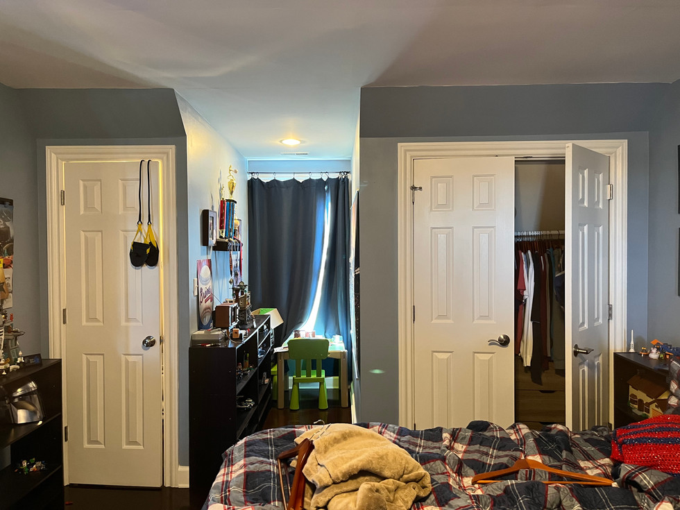
On the opposite end of the hall, the teenage son also sought a more grown-up retreat. While this area proved most challenging in the space department, we were able to problem solve with a bit of closet reconfiguration and careful furniture selection. The room's focal point is an upholstered platform bed with built-in drawers, which provided ample storage and eliminated the need for a bulkier dresser. The room's color scheme utilizes easy-to-clean blues and neutrals. The bedding keeps it simple with custom geometric pillow shams and not much "extra fuss". A unique, low-profile light fixture hangs above, adding a bit of contemporary flair. We addressed the need for more sun shading on this side of the home with thick roman shades and dressed them in a decorative tape to echo the bedding. We don't often get to do kids' rooms, so having teen rooms for both a boy and a girl to design was fun! We loved getting their input and hearing their imaginations run wild with how they wanted their rooms to look. On both the "girl's side" and "boy's side" of the second floor, the main goal was to give the O'Neal kids a functional and flexible base to add their own finishing touches to as they continue to grow and change!

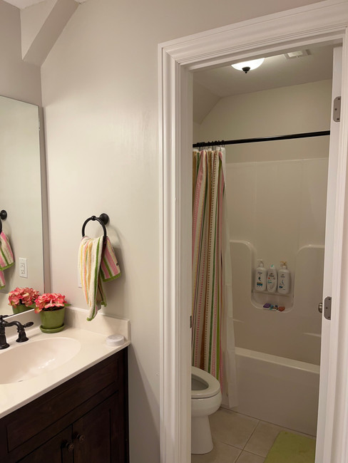
And finally, the teen boy's bath got an overhaul with sleek and bold design choices. By pushing back angled dormer walls, we were able to relocate the toilet and give the vanity space to breath. The new vanity, painted a striking blue, is complemented by a black-trimmed mirror and black fixtures. An ivory countertop adds a touch on contrast, while the wallpaper pattern harmonizes with the charcoal hard surfaces in the shower. Again, we utilized large scale tiles and slabs to minimize extra cleaning. and this dark, moody shower makes quite the statement in the finished space!
While primary bath changes are still in the works, the rest of this home is back to a bustling hub of energy and family life being lived well. We're so honored to have helped the O'Neal farmhouse evolve into a better space for dance practices, slumber parties, science projects, meetings, quiet nights in, and every little activity in between. This sweet farmhouse proved again that with the right planning, "home" can evolve right along with you.
Sources:



















Comments